Smart tools for paper people.
Brand Identity & Packaging
MeadWestvaco
Services
- Writing
- Design
- Message Development
- Art Direction
- Project Management
Deliverables
- Package Design
- Templates and Applications
- Tagline
- Brand Voice
- Brand Vision
Outlink is a revolutionary new series of paper-based personal organizers by MeadWestvaco. Outlink gives business professionals who hate smart phones and PDAs the unique ability to link seamlessly with their Outlook® calendars and address books.
Hartford Design created a modern, simple logo and packaging designed to emphasize the product and its features and benefits. The “smart tools for paper people” tagline is designed to help people self-identify with that market segment.
The result is packaging that jumps from store shelves in a product category that tends toward mundane, confusingly similar package design.

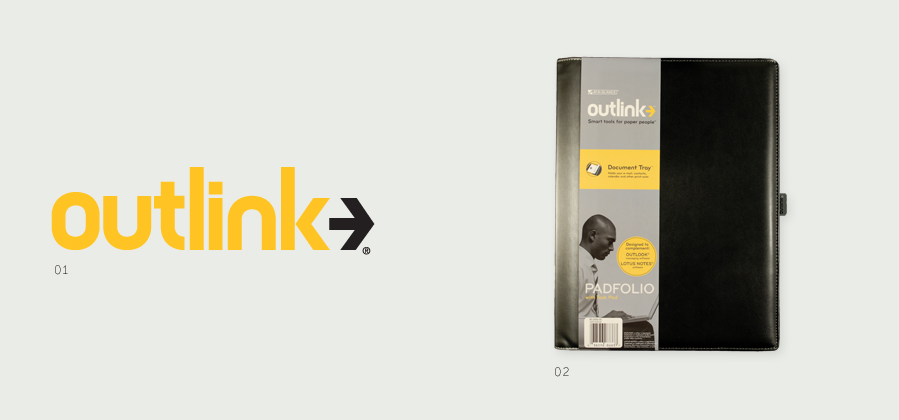
01 Logomark
The logomark depicted the process of connectivity simply and elegantly.
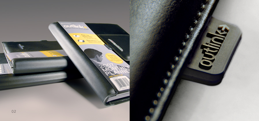
02 Package Design
The packaging was designed for maximum impact. The product features and benefits are treated hierarchically for quick reading.

Hartford Design. Taking Your Brand to New Places.™
Overview
Hartford Design is a Chicago graphic design and branding firm. We plan, design and deliver brand identity, websites and integrated marketing with clarity, consistency and purpose. Our clients range from startups to nonprofits to the Fortune 100 elite.
Copyright 2024 Hartford Design, Inc. All rights reserved